I've always been partial to the pop art era. Blocks of contrast and bold colors are what I adore about the art movement. I took this as an opportunity to look into many artworks that interest me from a variety of pop art artists. All the artworks I've chosen have a common theme, the media. Some are from comic strips, consumerism, portraits of celebrities, or album covers. Another common theme is most of these artworks have some sort of sexual underline. We see more in the pop art movement how pop culture is using women are sex symbols. The 60s focused on sexuality, consumerism, and technology.
Andy Warhol, Shot Marilyns, 1964
“In August 62 I started doing silkscreens. I wanted something stronger that gave more of an assembly line effect. With silkscreening, you pick a photograph, blow it up, transfer it in glue onto silk, and then roll ink across it so the ink goes through the silk but not through the glue. That way, you get the same image, slightly different each time. It was all so simple, quick, and chancy. I was thrilled with it. When Marilyn Monroe happened to die that month, I got the idea to make screens of her beautiful face the first Marilyns.”-Andy Warhol. Art is feeling a little industrialized, with the silkscreen, etchings, and woodcut prints. Which I didn't think about until I read Warhol's quote and how he said “assembly line effect.”
I love how Warhol started doing silkscreen prints as a commemoration of Marilyn Monroe. Not only did Warhol see art as something to manufacture on an assembly line, he saw people the same way. It slightly puts me off now that he thought of people that way, but it doesn't make me like his art any less.
I've always had such a fond love for Marilyn Monroe. I'd love to have this glorious woman hanging in my home. However, the actual portraits are quite large. She was such an icon in the model industry because she was sensual, but she was also a little larger, which didn't make her any less beautiful.
Monroe's death had already passed by the time the screenprints of a photo Warhol found of her. Monroe was a popular pop culture figure, and pop art is a pop culture movement. These post-mortem portraits of the infamous iconic Monroe were executed in the silkscreen medium. Warhol depicted his mass-produced silkscreen portraits as society's image of perfection. You can see the influence celebrities had on the masses with their forced ability to be perfectly flawless creatures. There were over four, but this first diptych is made of four portraits with different backgrounds: orange, red, turquoise, and cadmium. All the portraits are similar in the position of color, but each time it's always a little different. Its compelling how bold and bright the colors are in this silkscreen print, and there is over one image that emphasizes the effect of the almost holiness celebrities embody.
Andy Warhol, Banna 10, 1967
I picked this one purely because it's an album cover for the punk band Velvet Underground and Nico. Warhol's design was so iconic it became a permanent association with the band. I'd seen the Banana 10 before on the band's album cover, but I did not know that the outer skin part of the banana is a sticker. The sticker can be removed to expose a red detailed banana inside. This is the first time that something like this has ever happened, and it feels revolutionary to the art community. I think being able to get physical with art and have the viewer alter the artwork makes the viewer feel more involved.
This work of art is also a sex symbol kind of like Manore, but for the opposite gender. “Peel Slowly and See.”, is written above the banana on the album cover. Once you peel back the banana peel, a fleshy red-toned banana is discorded.
There's something so balanced with the simple white background with the bold dark mustard yellow, and the total black to add age to the banana. The contrast between the colors of the skin to the fleshy inside is quite a fascinating difference.
I'd gladly have this simply iconic fruit hanging on my wall. I love punk music and pop art, so it would be amazing to own this work of art.
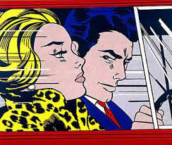
Roy Lichtenstein, in the car, 1963
I was ever so tempted to choose drowning girl by Roy Lichtenstein because in high school I did a of master copy of the oil painting. Instead of choosing a familiar topic, I looked into more of his artworks. I saw this one, and it again is it's a familiar painting. I swore I've seen this painting as an album cover for an early 2000 alternative band, but I can't for the life of me remember which band.
The theme for Lichtenstein's paintings was romance, and he exhibited it through comic strip artwork. The couple looks to be in a speeding motion in a red car shown by the lines that are like graphic art comic strips. Inside the car is a man with bluish hair, which is much more interesting than stark black hair. He has a quite brutish expression as he stares at the blond broad in his passenger seat. The woman is very well dressed and presents herself as a mature, stoic woman. She is looking forward, away from the man's gaze. The original comic was ‘Tomorrow and Tomorrow’ which was in the September 1961 issue of Girls Romances. In the original comic, the woman hates herself for getting in the car with the man and finding herself needing his company. It's a tragic love of women being treated unfairly in relationships with some irresistible, shallow men. The tragedy comes out through the woman's face, the way she holds her head up and aces her eyes look as if she's holding back tears. You can just feel the tension inside the car between the two distant subjects.
I love the harsh black line art surrounding the flat colors of the figures and background. It's such a direct gestural art movement, which feels so new to what the art community had seen before the 60s.
Tom Wesselmann, Seascape Dropout,1982
This woodcut print is correlated with a series Wesselmann started in 1967 called ‘ Drop Out's'. Today this print is in Tate Britain.
I looked through a gallery of Wesselmann art and I didn't think about what a nude painting would look like with the pop art characteristic until then. I've looked through many of his artworks now, and I can say there are some very funky breasts. It's very thought-provoking to think about nudes throughout the ages and how taboo it was to how expressed and demanded they are now.
I found this image to be an interesting use of negative space. The seascape behind the woman is framed using the lighter negative space that represents the woman. There are more shaded and highlighted defined body parts that make up the rest of the woman. All of her skin in the negative space is a flat light skin tone except the nipple and areola. The shape was planned through the woman's position. She's in a profile pose with her breast and torso from the left side of the composed shape. her descending arm creates the other wall and her thigh closes the form. It's interesting and the shape could also be a landscape. I am reminded of mountains when I focus on just the shape and not the pop art inside and around the shape.
I love the landscape in this image because you can see the undertones of the clouds, and it's just an all-around beautiful day. I'm excited for the snow to be all melted and outside can look how it does in this print. There is such bold simplicity, but that does not pull away from the thought process of the composition.
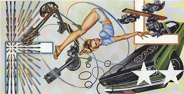
Peter Phillips, Art-O-Matic Loop Di Loop,1972
I had a hard time finding much information on this piece. I chose this painting because it was an album cover, but I wasn't aware of that till I was doing the research. Her body also stuck out at me. I've been looking at a lot of Michelangelo's paintings and sculptures, and they all have very defined flexed muscles. The details in the folded women's pose look so realistic but still odd, like the mannerism of renaissance art, but that's just my opinion.
There are a lot of strong earth tones in the painting, which adds color harmony to the painting. The composition of this piece is chaotic in nature, which piqued my interest. I like the consistency with the right angles throughout the painting. The pin-up girl in the middle seems to be the focal point. A beautiful woman, a cool car, and simple geometric shapes were all the rage of men during the 70s. There was also a common theme throughout Phillips's other oil paintings. The women in the middle are directly used in other paintings with cars and shapes.
Art-O-Matic Loop Di Loop is located in a private collection, and I'm hoping it's in a garage. Although it is a priceless work that should be protected and loved, I just wish it could do all of that in a garage. When I see this piece, I’d imagine it in a bar or a garage, but I'd be owned by a man.
James Rosenquist, I love you with my ford, 1961
When I saw this image, it was truly what the hell am I looking at moment. I was so intrigued and weirded out at the same time. I just knew I wanted to know the context of this graphic work.
Before Rosenquist became one of the fathers of pop art, he used to paint advertisements on billboards. He took his previous skill and turned it into large-scale oil paintings, which were also a type of advertisement. He took simple spaghetti and made it a focal point in the painting. Ford also portrays some essence of consumerism. The woman in the middle panel represents sexuality. Just look how sensual she looks with her eyes closed and her mouth partly open, like she's getting ready for a passionate kiss.
There's such a contrast between the masculine ford, the lovely lady, and the spaghetti. It's an odd pairing of subjects, to say the least. All three of the panels are quite zoomed in and away from any context. Only the canned spaghetti is in color, which is interesting. What was so special about spaghetti to make it the only subject in color?
As of now, Rosenquist's painting is located in the Moderna Museet art Museum, in Sweden. The dimensions of this work of art are 210 × 237,5 cm, so you can see how large he paints. I cannot imagine how long that must have taken to dry.
Andy Warhol's Marilyn Prints, http://www.webexhibits.org/colorart/marilyns.html.
Publicdelivery. “Why Did Andy Warhol Paint Marilyn Monroe?” Public Delivery, 19 Oct. 2021, https://publicdelivery.org/andy-warhol-marilyn-monroe/.
“Analysis: Andy Warhol’s Banana, 1967.” Analysis: Andy Warhol's Banana, 1967, https://news.masterworksfineart.com/2019/06/12/analysis-andy-warhols-banana-1967.
Art3Network. “Known under the Name in the Car.” In The Car | Roy Lichtenstein, http://www.artpieces.net/in-the-car.html.
“1972 The Cars ‘Heartbeat City’ Album Cover.” Peter Phillips, https://www.peterphillips.com/art-o-matic-loop-di-loop-1972-the-cars-heartbeat-city-album-cover-1984/.
Lichtenstein, Roy. “In the Car.” National Galleries of Scotland, National Galleries of Scotland, https://www.nationalgalleries.org/art-and-artists/664/car.'
Artsgraph, and Artsgraph. “I Love You with My Ford – James Rosenquist.” ArtsGraph, 20 Apr. 2014, https://artsgraph.wordpress.com/2014/04/19/i-love-you-with-my-ford-james-rosenquist/.
Tate. “'Seascape Dropout', Tom Wesselmann, 1982.” Tate, 1 Jan. 1982, https://www.tate.org.uk/art/artworks/wesselmann-seascape-dropout-p07760.


You have chosen some interesting pieces for this blog. I can easily see the connection between your pieces to the concept of sexuality. In the Car is my favorite of your series. The forms of the people, their clothes and even the allusion to the car are well crafted. Rather than a look of sadness, I see a look of indifference on her face as the man smirks that she chose to accompany him.
ReplyDeleteThe other piece I found interesting, I chuckled at it as I looked at was I Love You with my Ford . What I see in the middle frame is a woman and I can't help but see an ear behind her nose and a hairline further to the left of that. It's almost as if she is whispering to it. From that, I created this whole scenario where they concluded their moment of passion and she is now asking her partner for them to drive and get her some spaghetti with the Ford.
Those two pieces stood out to me.